

NEXT CASE
2019
2022
Design Lead @ Cazoo
Sending fewer people into checkout, and selling more cars.
Rebuilding the journey people used to buy a car online, from launch to a public listing in under two years.
My role
Joined as senior product designer, left as design team lead
Timeline
2019 → 2022
Team Composition
Second designer in. Grew to twelve, six reporting to me.
LINK

" height="288px" id="Q3PkPoZOk" width="1589.669298747799px"/></svg>)
Cazoo sold used cars entirely online. No showroom, no haggling, delivered to your door with a seven-day return. The proposition was new enough that most of the design problem was trust rather than usability. It launched in 2019, listed publicly inside two years, and has sold over 90,000 cars.
If you only read one part
Every click into checkout locked a car. People were entering just to find the monthly payment, so thousands of vehicles sat reserved by people who were only browsing. I moved the finance calculator onto the vehicle page. Fewer people entered checkout, and completed orders rose 73%.
The problem
After the MVP launched, the data said people did not yet understand or trust buying a car entirely online. Underneath that sat a set of specific failures.
People viewed the vehicle page and did not proceed.
The finance calculator sat on the fourth page of checkout.
Entering checkout locked the vehicle, so browsers were holding stock nobody could buy.
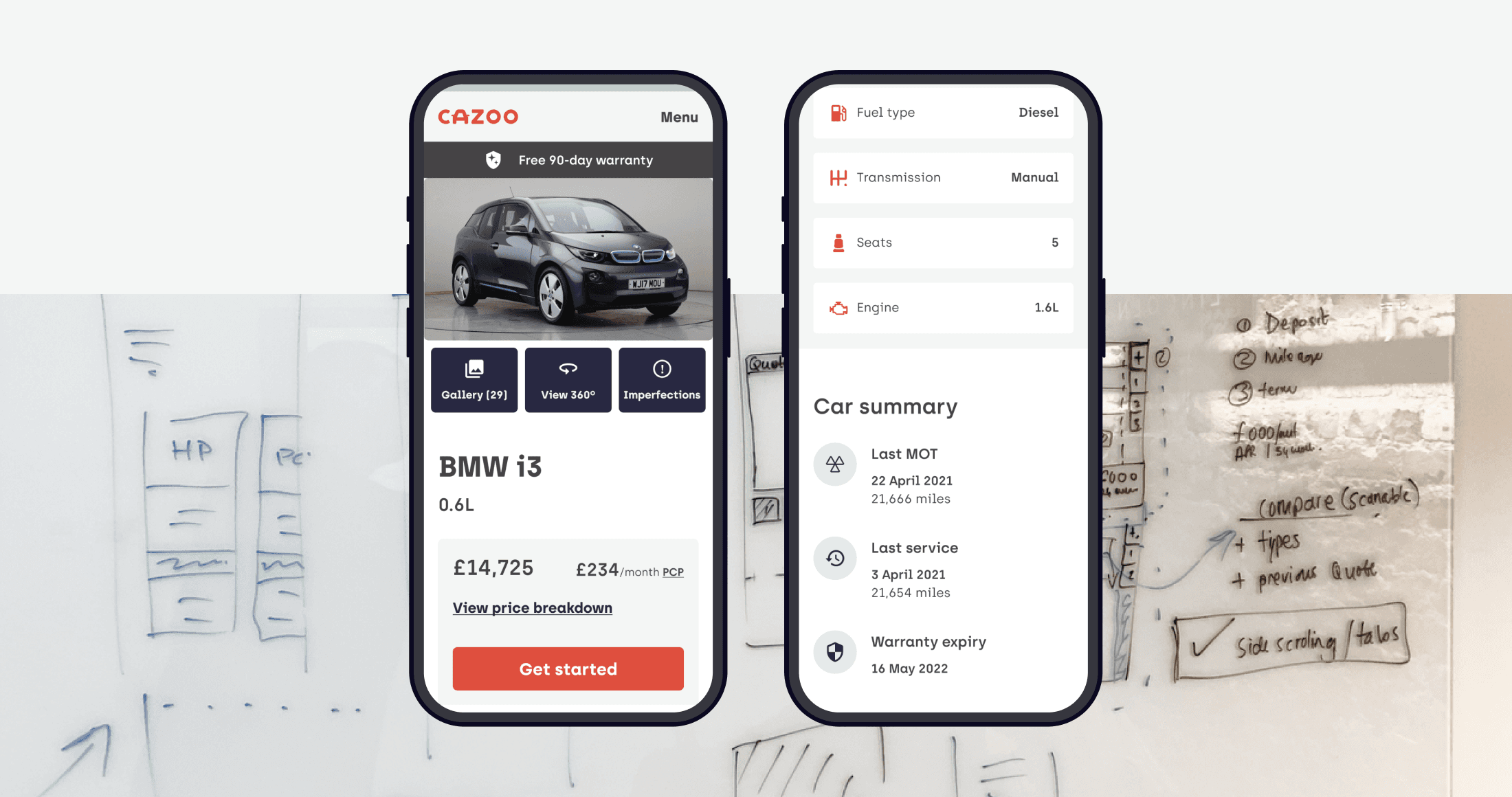
People could not tell which control opened the 360 gallery.
High volume of calls to customer service.
When they did proceed, most were only working out what it would cost per month.
The bounce rate on that page was the highest I have seen in my career.
The gallery took fifteen seconds to load.
Weak hierarchy on the car's own information.
Two designers, for all of it.
Buying a used car online was a new behaviour, so every point of friction read as a reason not to trust it.
Ask yourself, looking at the image below: Which icon is the 360º gallery? Which one is the imperfections? Which one is the interior?
Yes, sometimes even an icon can be a problem.
The goal
Agreements to make sure things have value on delivery.
01.
Help people find the right car
Fix the gallery, make the car's information discoverable, lift the get-started rate.
02.
Answer the money question before checkout
Nobody should have to reserve a car to find out what it costs per month.
03.
Build a team that could keep up
Hypergrowth with two designers was not a staffing problem, it was a quality problem.
What I did for the product
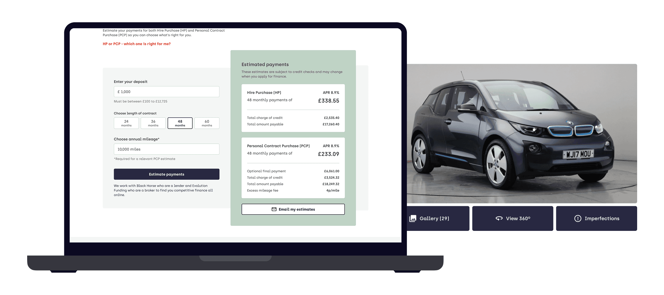
Moved the finance calculator out of checkout and onto the vehicle page.
The calculator was on the fourth page of checkout, behind name and email, behind the upsells, behind the payment choices. People were walking that whole path just to see a monthly figure, and the bounce on that page was the worst I have encountered. Worse, entering checkout locked the vehicle, so every curious browser took a car off the market. At any real volume that is an inventory crisis, not a UX problem.
I made the case to legal and to finance, since a monthly figure shown outside a regulated checkout has consequences for both, and got agreement to put the calculator on every vehicle details page.
Checkout entries went down. That was the point. The people who entered had already answered their biggest question, so completed orders rose 73% and the inventory stopped being held hostage by people who were only looking.
Made the car's flaws impossible to miss.
This came from a single research session. A customer buying his third car told us Cazoo could be more transparent about condition. It was not a business priority and nobody had asked for it, but every used car has scuffs and the industry convention is to photograph around them.
I designed a global pattern for imperfections: every mark documented, photographed and shown on the vehicle page, treated the same way across the whole catalogue. Opening the imperfections gallery went up 63%, and the people entering checkout afterwards were better qualified, because they had already accepted the car as it actually was.
Rebuilt the vehicle details page around a clearer hierarchy.
We tested the live site first to find the real problems rather than the assumed ones, then tested three designs against each other. What shipped: a proper hierarchy for the car's facts, iconography with labels so the controls were legible, a gallery that loaded, and the calculator in place. Get-started clicks rose 54%, page views 45%, and interaction with the 360 gallery 35%.
What I did for the team
Built the team from two to twelve.
I joined with the intent of moving into a lead role, and the route there was helping build the function. I wrote the job descriptions, ran hiring, brought in contractors when delivery outpaced headcount, and handled the harder side of that too, including letting people go when it was not working. By the time I left there were twelve designers, six reporting to me and six to the other lead, with staff and senior staff levels introduced so people could grow without having to manage.
Taught craft, specifically UI.
Hiring quickly at that stage means hiring people at different points in their craft, and the standard has to be taught rather than assumed.
Put in a process that could survive the growth rate.
Discovery and framing before delivery, so work started from a problem rather than from a request.

The team changes
Design team, 2 → 12
Designers when I joined
Hires who joined after
Two to twelve, with staff and senior staff levels introduced along the way.
The outcome
completed orders, after the calculator moved out of checkout.
get-started clicks
imperfections gallery opening
The calculator decision is the one I would point at. The metric everyone watched, checkout entries, went down, and the business result went up. Fewer people started, more people finished, and the inventory was no longer being locked by people who only wanted a number.
The imperfections pattern did something harder to measure. Showing a car's flaws deliberately, at a moment when the whole category was hiding them, made the proposition believable. It came out of one research session that nobody had asked for.
And the team outlasted the projects. Two designers to twelve, with the levels and the process to keep going.